

Primo Posto
意式餐厅
2025
Hong Kong
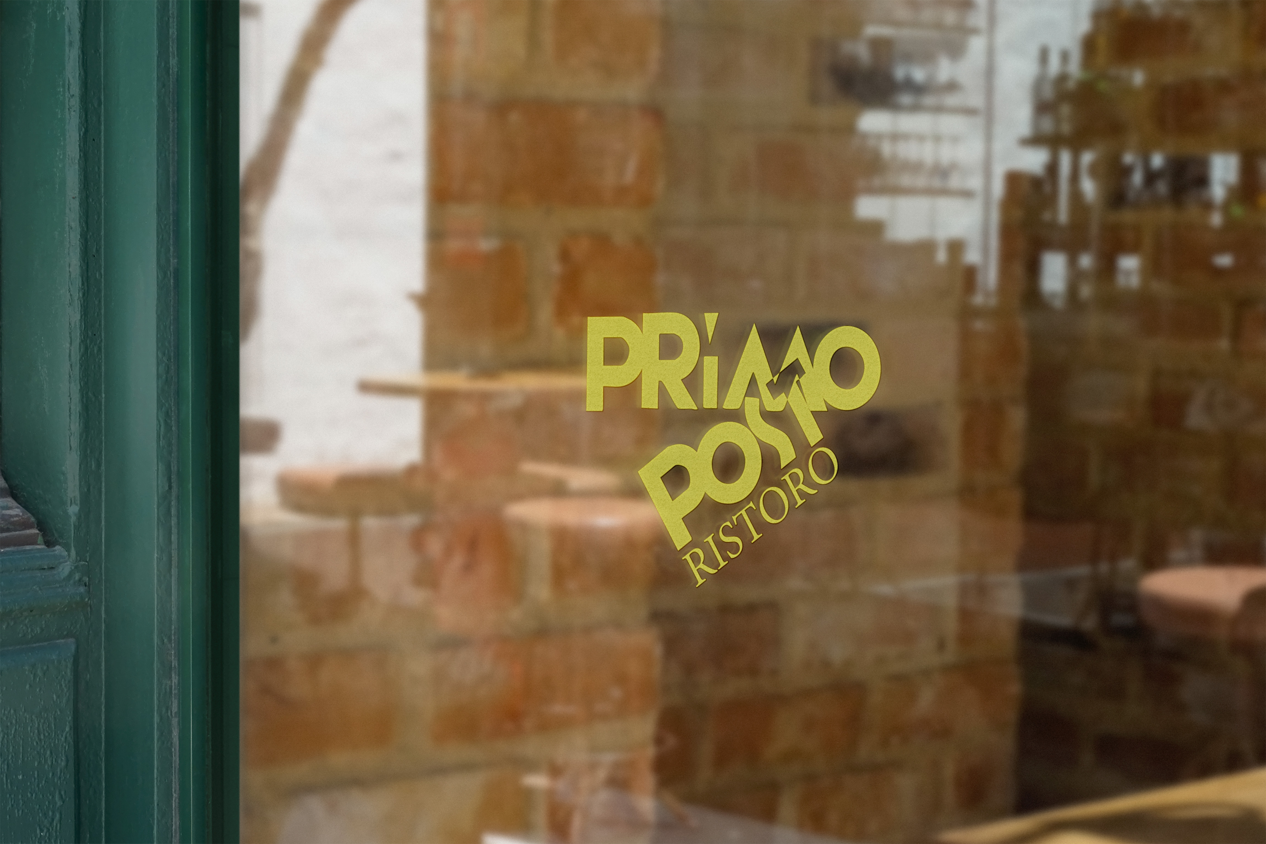
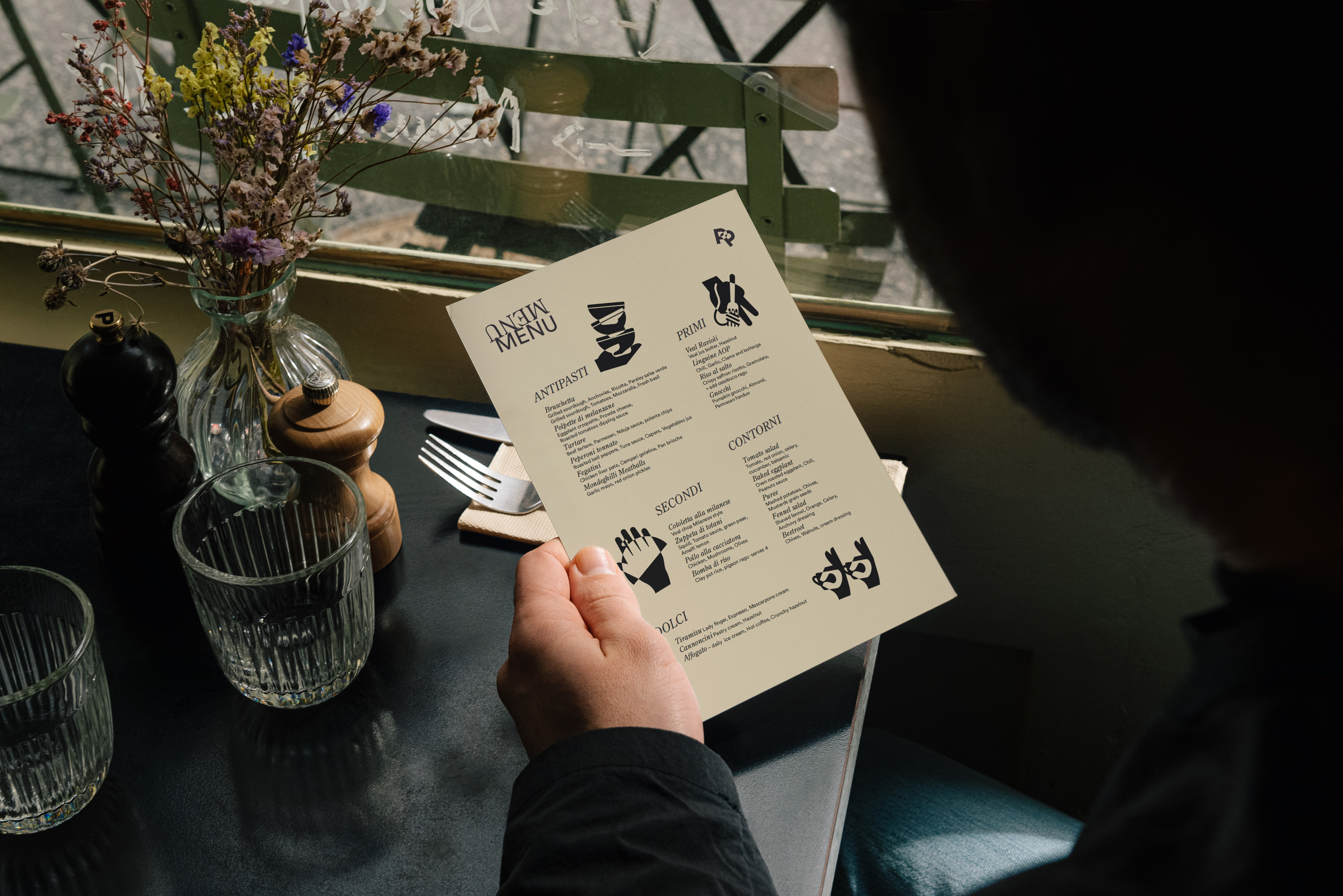
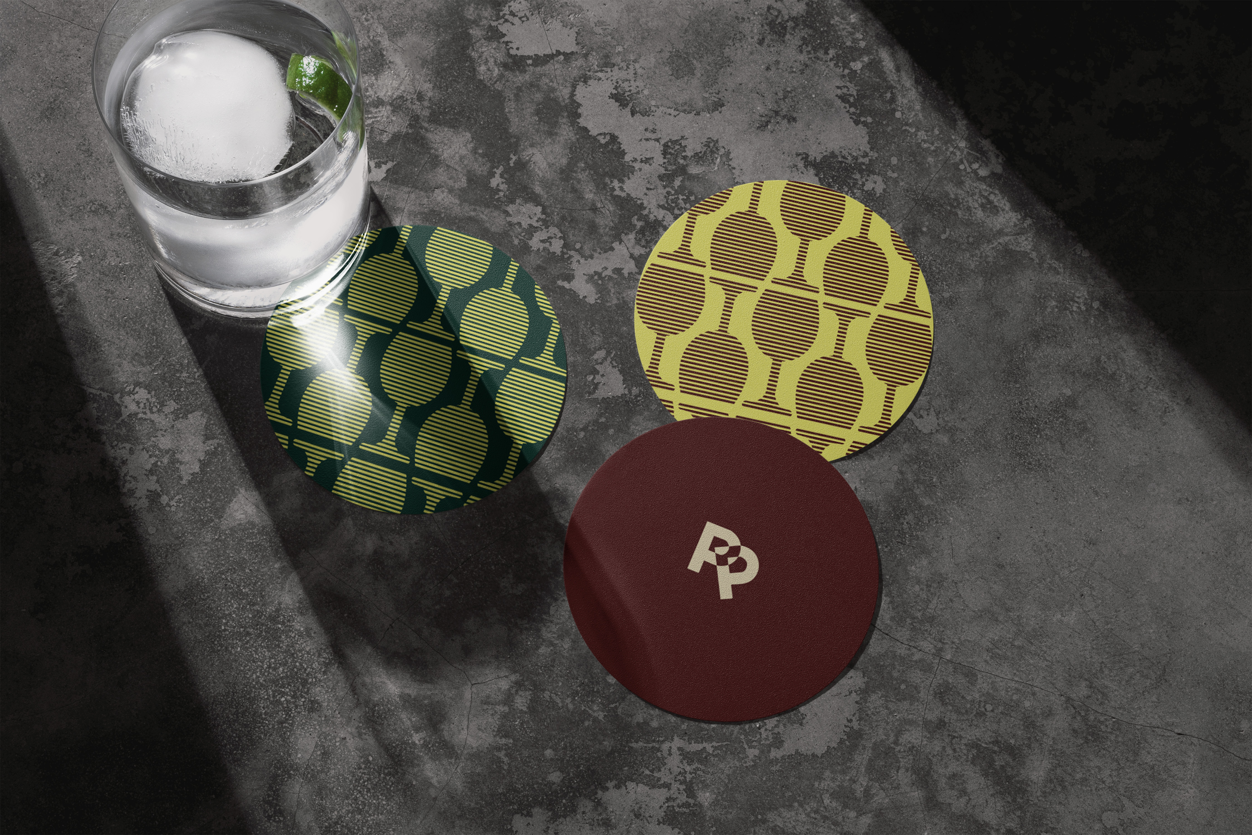
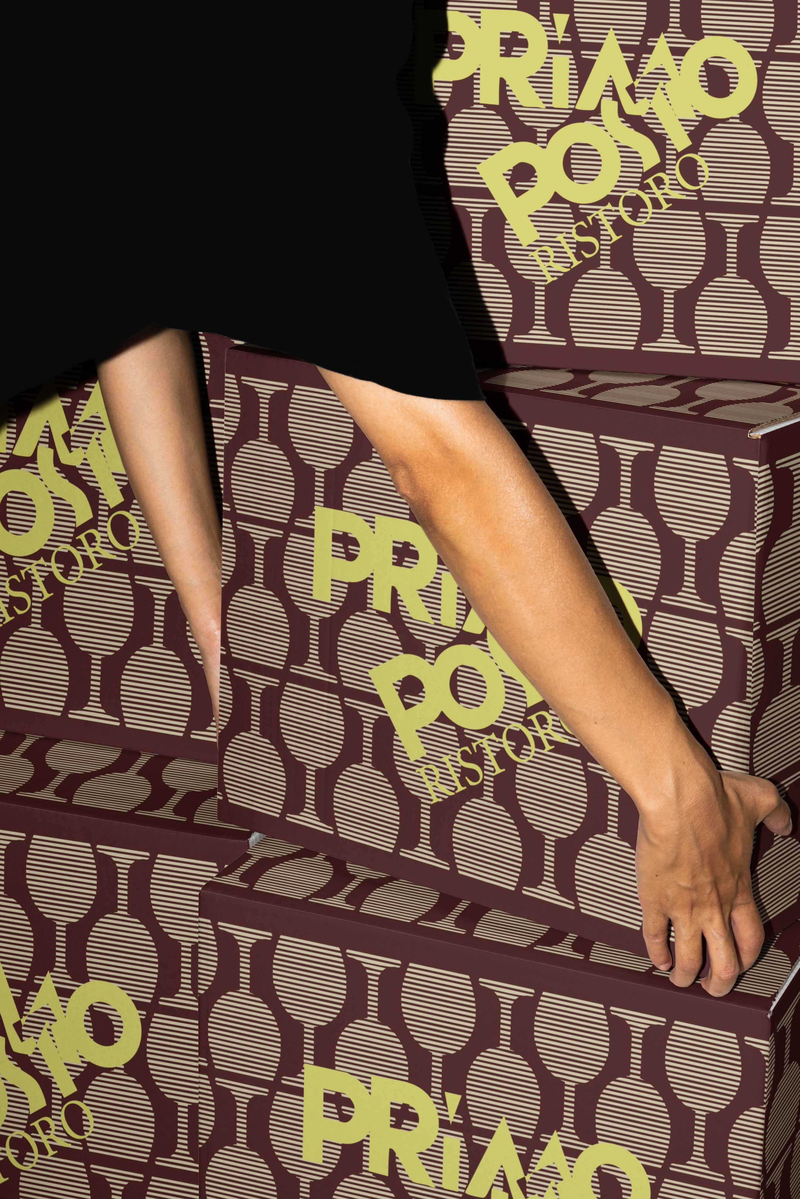
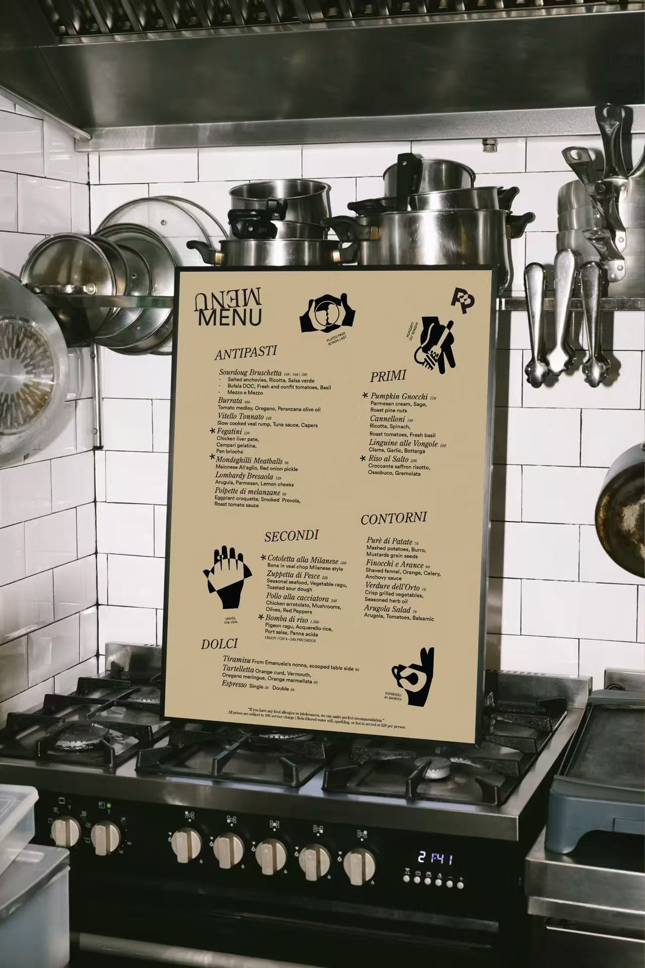
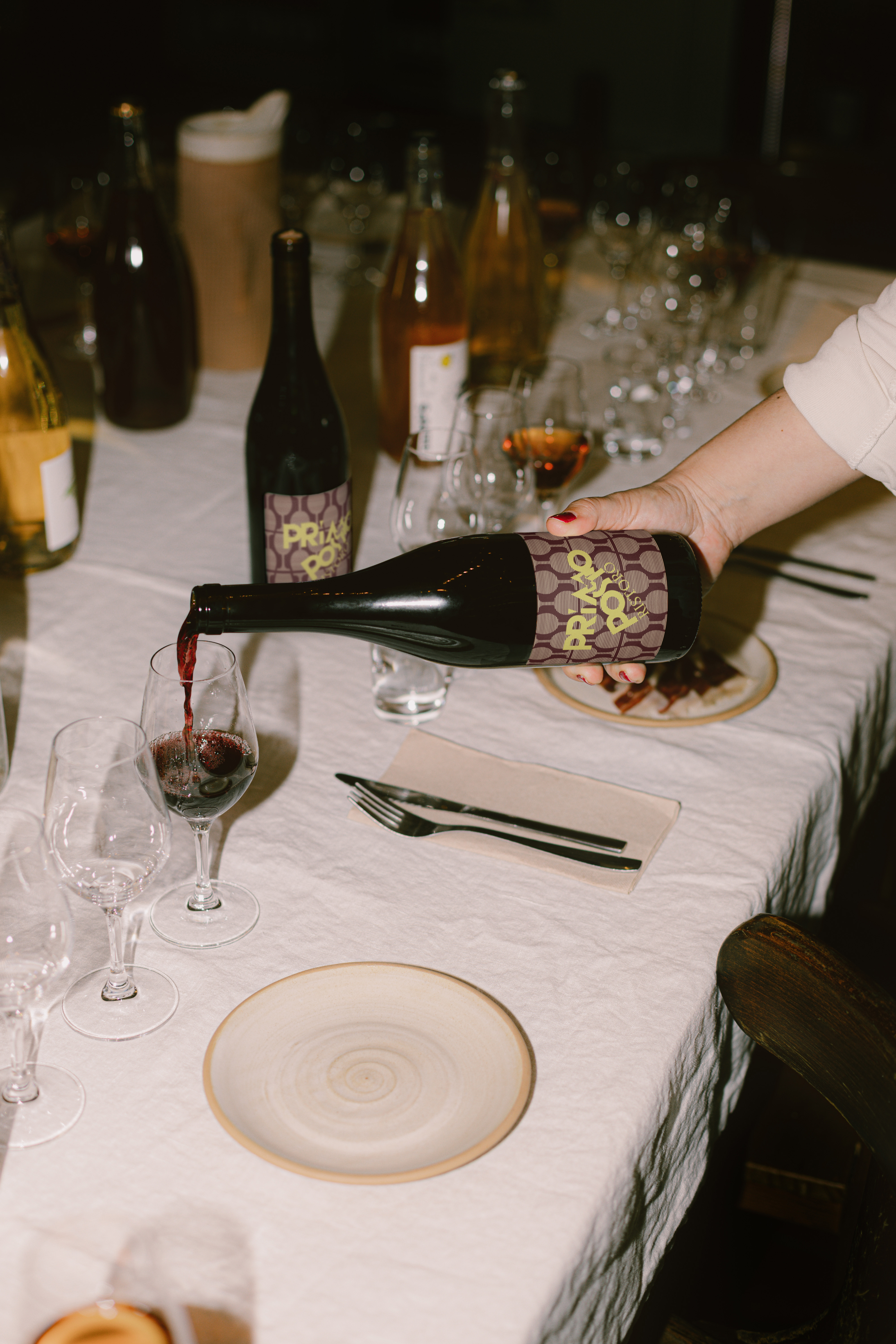
Primo Posto, an Italian restaurant in Hong Kong, takes its name from “The First Place.” Its brand identity merges Milanese charm with futurism, creating a bold visual representation. The dynamic “P” logo reflects strength, while the integration of gesture-inspired illustrations adds cultural depth.
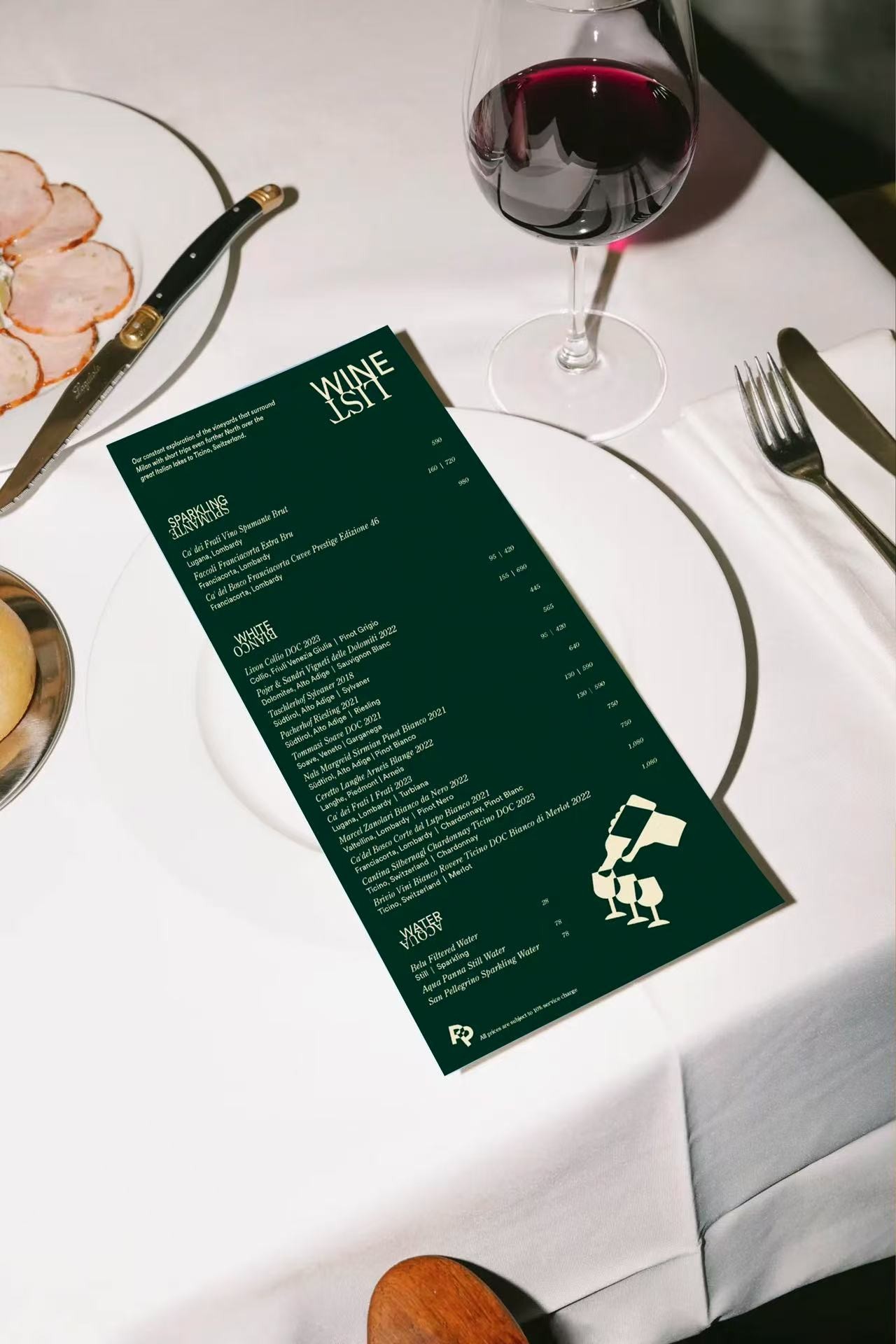
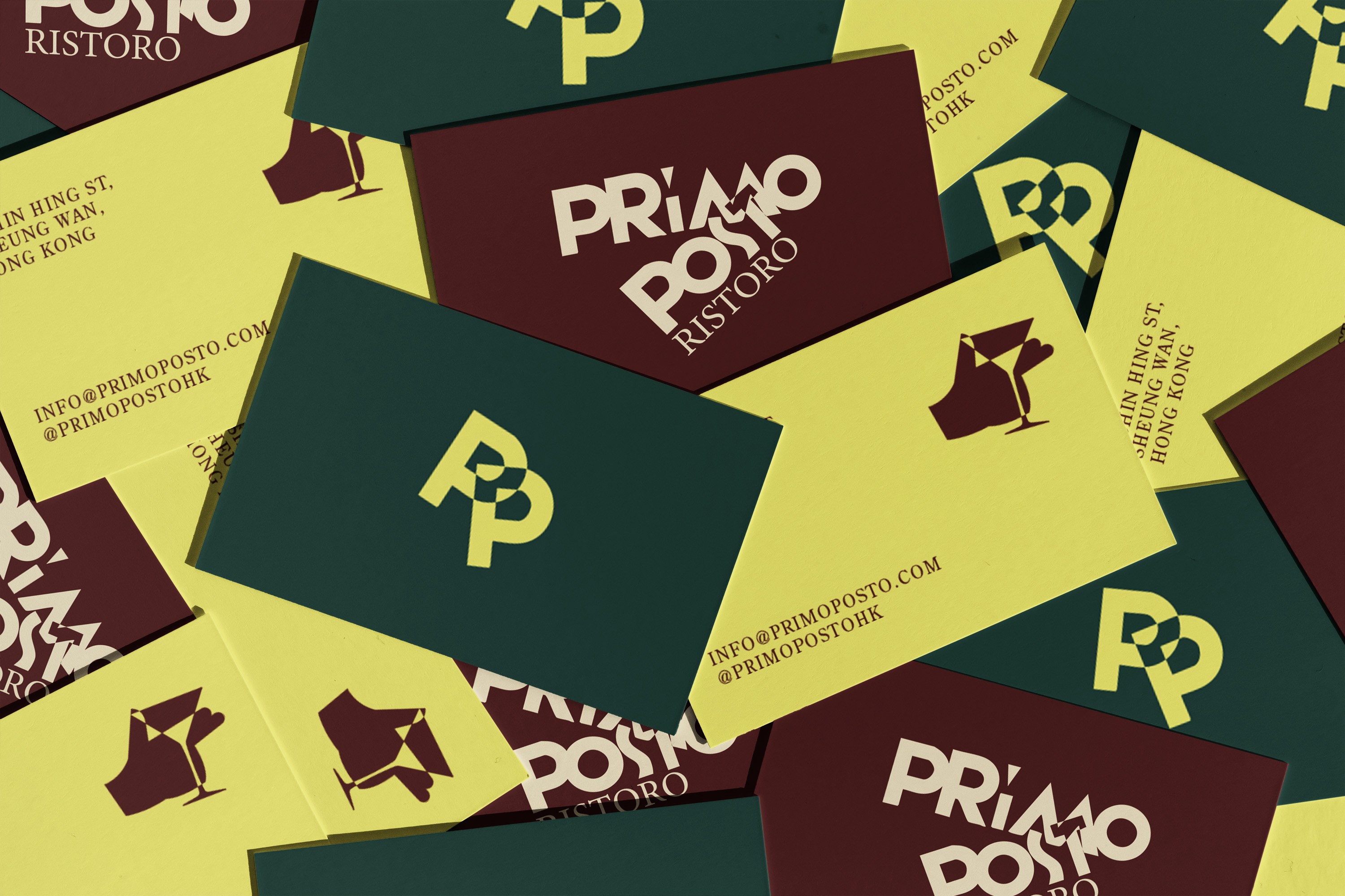
The three-color palette fuses vintage Italian passion with modern rhythm, creating a distinct identity that stands out. From business cards to placemats, the visual identity strengthens recognition, making Primo Posto a standout in Hong Kong’s dining scene.
Primo Posto 是一家位于香港的意大利餐厅,品牌名意为“The First Place”。它的品牌视觉灵感结合了北意风情与未来主义的设计语言,体现了意大利经典美学与现代感的完美融合。餐厅的标志性动态 LOGO 以字母“P”为基础,创造出一股独特的张力,体现了品牌的独特个性。设计师还巧妙地将意式手势插画融入其中,增强了品牌的地域性和文化深度。
品牌色调融合了复古和现代的元素,使用了三种颜色的共生搭配,既展现了意大利文化的热情与疯狂,又塑造了流动的未来感。每一个品牌接触点都成为了顾客记忆的鲜明印象,无论是名片还是餐垫,Primo Posto 的设计都让它在香港餐饮界独树一帜。

inquiries
中国大陆 Mainland China
bella@wearepanglossian.com
中东/亚太地区 Middle East, Asia Pacific
matteo@wearepanglossian.com
欧洲/美洲 Europe, Americas
benedetta@wearepanglossian.com
our houses
深圳 Shenzhen
4th Floor, Building 15, Honghuayuan Village, No.38, Honghua Road, Nanshan District, Shenzhen
香港 Hong Kong
Unit D 23/F Centre Mark II, 305-313 Queen's Rd Central, Hong Kong
威尼斯 Venice
Calle Seconda de la Fava, 5990, Venezia
© 2025 PANGLOSSIAN STUDIO.
All Rights Reserved.


Primo Posto
意式餐厅
2025
Hong Kong
Primo Posto, an Italian restaurant in Hong Kong, takes its name from “The First Place.” Its brand identity merges Milanese charm with futurism, creating a bold visual representation. The dynamic “P” logo reflects strength, while the integration of gesture-inspired illustrations adds cultural depth.
The three-color palette fuses vintage Italian passion with modern rhythm, creating a distinct identity that stands out. From business cards to placemats, the visual identity strengthens recognition, making Primo Posto a standout in Hong Kong’s dining scene.
Primo Posto 是一家位于香港的意大利餐厅,品牌名意为“The First Place”。它的品牌视觉灵感结合了北意风情与未来主义的设计语言,体现了意大利经典美学与现代感的完美融合。餐厅的标志性动态 LOGO 以字母“P”为基础,创造出一股独特的张力,体现了品牌的独特个性。设计师还巧妙地将意式手势插画融入其中,增强了品牌的地域性和文化深度。
品牌色调融合了复古和现代的元素,使用了三种颜色的共生搭配,既展现了意大利文化的热情与疯狂,又塑造了流动的未来感。每一个品牌接触点都成为了顾客记忆的鲜明印象,无论是名片还是餐垫,Primo Posto 的设计都让它在香港餐饮界独树一帜。

inquiries
中国大陆 Mainland China
bella@wearepanglossian.com
中东/亚太地区 Middle East, Asia Pacific
matteo@wearepanglossian.com
欧洲/美洲 Europe, Americas
benedetta@wearepanglossian.com
our houses
深圳 Shenzhen
4th Floor, Building 15, Honghuayuan Village, No.38, Honghua Road, Nanshan District, Shenzhen
香港 Hong Kong
Unit D 23/F Centre Mark II, 305-313 Queen's Rd Central, Hong Kong
威尼斯 Venice
Calle Seconda de la Fava, 5990, Venezia
© 2025 PANGLOSSIAN STUDIO.
All Rights Reserved.